A completely rebuilt checkout
Same steps, same fields — it just looks considerably better, feels faster, and converts better.
A completely rebuilt checkout
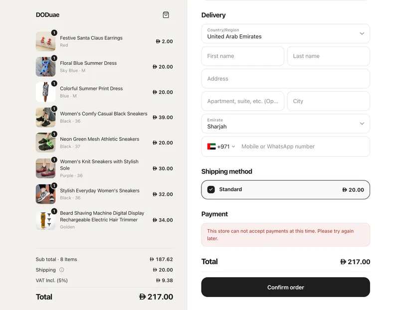
We've rebuilt the Eaglecart checkout from the ground up. Everything works exactly as it did — the same steps, the same fields, nothing hidden behind extra pages. It simply looks considerably better, feels faster, and converts better.
Built for the screen it's on
On desktop
The checkout is now two panels. The order sits on one side and the form on the other. Your customer's items and their total stay visible the entire time they're filling in their details — they never lose sight of what they're buying or what it costs. Their products scroll within that panel if there are several; the total stays pinned in place. The form and the Pay button sit together on the same side, so nobody has to cross the page to complete their order.
On mobile
The order summary is a single tappable line at the top showing the item count and total, with your product images stacked into one neat group. Tap it to see everything. The full breakdown appears again above the Pay button, so the amount is confirmed exactly where the decision is made.
On tablets
The form now sits at a sensible reading width instead of being stretched across the screen.
Easier to fill in
Field labels sit inside each field and rise as the customer types, so the form is easy to scan whether it's empty or half-complete. Spacing follows one consistent rhythm throughout, and the page is meaningfully shorter as a result. Nothing has been hidden, moved behind extra steps, or removed; it's simply better organised.
Faster
The checkout uses your customer's own device font, so there's nothing extra to download before the page appears — one fewer thing standing between them and paying. Sections reserve their space before they load, so the page doesn't shift under a customer's finger as they reach for a button.
Payment methods that look right
Each provider's logo keeps its own proportions instead of being squeezed into a fixed box, and they line up neatly however many payment options you offer. Selecting a method reveals a short line explaining what happens next — whether they'll be redirected, or paying the driver on arrival.
Arabic, properly
In Arabic the entire checkout mirrors correctly: the layout, the form, the totals, and every icon. Not a translation on a left-to-right page, but a genuinely right-to-left checkout.
Also fixed
Details are always current
Editing a name after picking a payment method could leave the checkout checking an earlier version of the form. Every change now saves as it's made.
Nothing gets lost on a slow connection
An older update can no longer overwrite a newer one, so a shipping option a customer already changed away from won't reappear.
No stuck payments
If the connection drops mid-confirmation, the customer gets a clear message and a working button instead of an endless spinner.
Payments are never wrongly failed
A provider declining a payment and a provider not answering are now treated differently. Previously both counted as failures — which in rare cases meant a customer paid and no order was created. A paid order now always becomes an order.
Abandoned attempts close themselves
They close once the provider confirms they've expired, instead of sitting open in your records.
Built to keep improving
The checkout is built on a single set of design values, so improvements reach every part of it at once and consistently — and that's work we handle, not something you ever need to touch.
We built it this way because we're expanding fast: more payment providers, more delivery and pickup options, more regions. Each of those has to arrive without the checkout being torn apart and rebuilt around it. Pickup is a good example — its place is already built and waiting. When we release it, stores offering both delivery and collection will see a switch appear automatically, and stores offering only delivery won't see anything change at all.
And we've committed to keeping it lean. No third-party scripts, no tracking bloat, no widgets loading things your customers didn't ask for. Everything the checkout needs is built in and handled for you — which is why it's fast, and why it stays fast as we add to it.