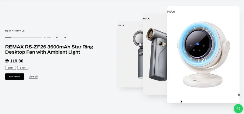
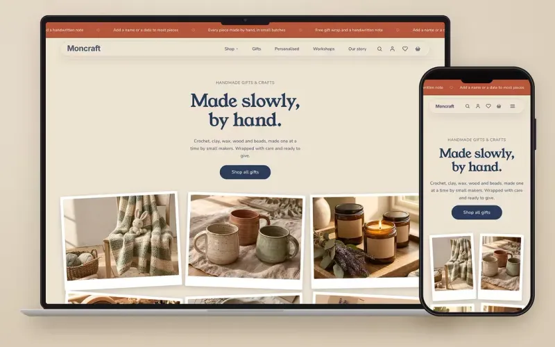
Add to cart on every product card, with a quick add popup
Shoppers can now add products to their cart straight from any product card, without opening the product page.
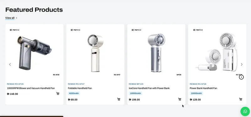
Add to cart, right from the card
Shoppers can now add products to their cart straight from any product card on collection pages, product grids, product showcases and other product lists, without opening the product page. An add to cart button now appears on every product card and is turned on by default. Store owners can turn it on or off under Theme Settings › Cards.
One tap for simple products
Products without variants or options are added to the cart in one tap. The button shows a check mark and the cart drawer opens.
A quick add popup for variants and options
Products with variants or options open a quick add popup. Shoppers can pick a colour, size or option, set the quantity and add to cart without leaving the page. The popup works just like the product page: the image gallery, price, sale price, variant selection, options, quantity and the WhatsApp button where enabled. It also includes a “View full details” link for shoppers who want the complete product page. Store owners can turn off the quick add popup, and cards then link to the product page for products that need a selection.
Made for mobile and desktop
On mobile the popup opens as a bottom sheet with the add to cart button kept in view. On desktop it opens as a centred popup. There, the image gallery matches the main image height and the thumbnails scroll alongside it, so products with many photos look clean. The add to cart button uses the full width so its label and price are easy to read.
Display options under Theme Settings › Cards
Choose how the button looks. Icon beside title, the default, is a light round icon next to the product name. Icon on image is a round icon on a corner of the product image, and it automatically picks a free corner so it never covers sale or product tags. Full button is a full-width add to cart button below the card details. For the icon, choose cart with plus (new, and the default), cart, bag, basket or plus. For Icon on image, choose a Light style, always visible with a soft frosted background and the default, or a Hover style that appears on hover in the button colour.
Sold-out products stay protected
Sold-out products show a disabled button, so shoppers can't add them by mistake.