New section in MON Studio: Product Showcase
Show your products in seven display styles, and switch between them any time.
One section, seven ways to show your products
The new Product Showcase section puts a hand-picked set of products, or products from one collection, on your homepage in seven display styles. Pick the style that fits your brand and switch styles at any time without setting the section up again.
Stack, the default
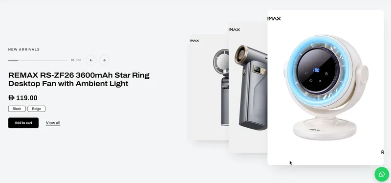
Stack shows products as a deck of cards that shuffles from one product to the next with a smooth card-swing animation. The product name, price and an Add to cart button sit beside the deck. Shoppers can choose a variant and add it to the cart straight from the homepage, without opening the product page. Products with custom options show a “Choose options” button that takes the shopper to the product page.
Six more styles to choose from
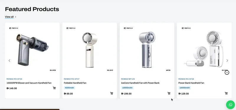
Classic uses the theme's standard product cards in a grid or slider. Bento is a modern mosaic layout with mixed tile sizes. Gallery is a swipeable row of products that can open with a collection card showing the collection's product count and end with a “View all” card. Coverflow is a 3D carousel with the current product in front and the others angled to each side. Strips are tall image strips that expand on hover and become a swipe row on mobile. Index is a large numbered list of product names: on desktop the product image follows the cursor, and on mobile a small thumbnail shows next to each name.
Choose your products
Choose up to 8 products by hand, or pick one collection and set how many products to show and how to sort them. Sale prices are highlighted: the original price shows crossed out next to the sale price, and a discount badge, for example -20%, appears on the product image. Both can be turned on or off.
Motion and controls
Autoplay is available for Stack and Coverflow. It pauses when the shopper hovers, when the section scrolls out of view, and when the browser tab isn't active. Shoppers get a progress line with a product counter, previous and next arrows, swipe on touch screens and arrow-key navigation. For Stack you can choose the card transition (stack, fan or fade), plus the deck depth and animation speed. Products in Bento, Gallery, Strips and Index can animate in as the shopper scrolls.
Design options to match your brand
Set the image ratio (Square, Portrait, Landscape, 4:5 or 2:3), corner radius, card shadow and hover zoom. Add a caption and heading, and choose the heading size and alignment, with a “View all” link placed beside the heading or below the products. The link uses the chosen collection automatically when no link is set. You can also place the image on the left or right for Stack, set the columns for Classic and Gallery, and adjust the strip height, gap, colour scheme, section width and spacing. The editor only shows the options that apply to the chosen style.
Built for every store
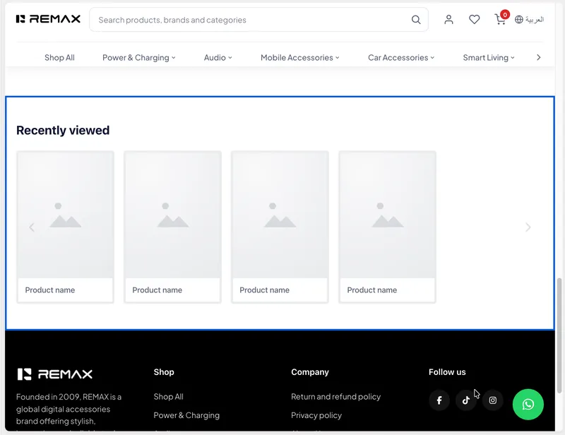
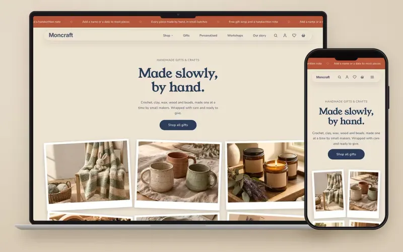
Product Showcase works fully in right-to-left languages such as Arabic, with optimised layouts for desktop, iPad and mobile. It loads fast with responsive images and no layout shift while the page loads.