Chart settings in the menu
Change your chart color and type, and show or hide charts, from a new settings option.
Control your charts from settings
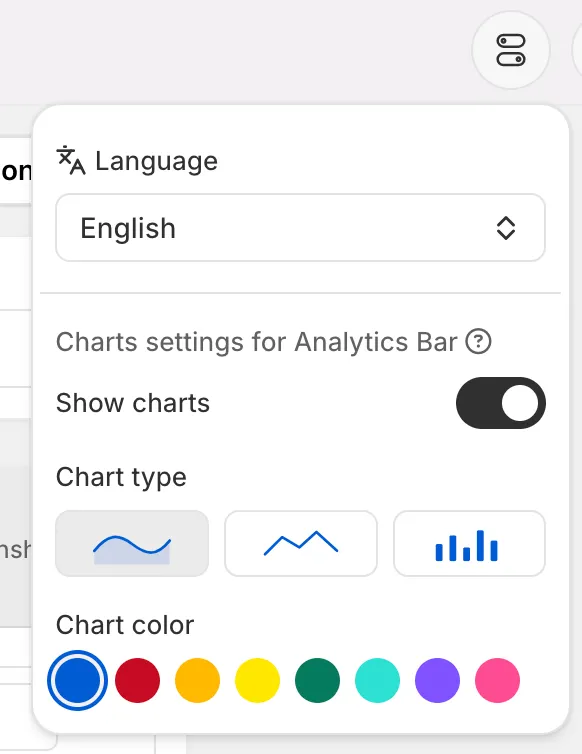
We added a settings option in the menu for your charts, so you decide how your analytics look and what shows.
Show or hide your charts
You can turn the charts on or off. Show them when you want the visual at a glance, or hide them for a cleaner, numbers-only view.
Pick from three chart types
Choose the chart type that fits your data best — line, area, or bar. Line is great for tracking a trend over time, area adds filled emphasis under that trend, and bar makes it easy to compare values side by side.
Change the chart colors
Set the colors to match the look you want, so your charts fit your dashboard instead of a fixed default.