Monisa: A Soft, Editorial Theme for Clean Beauty
A new theme for clean skincare and cosmetics brands, with a luminous, restrained, French-pharmacy feel.
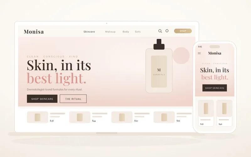
Monisa
Monisa is a soft, editorial beauty theme for clean skincare and cosmetics brands. It has a luminous, restrained, French-pharmacy sensibility, built for brands that sell trust and beauty in equal measure.
Who Monisa is for
Monisa is for clean skincare and cosmetics brands whose customers buy on credibility as much as on looks. If your range is built around considered ingredients and a clear point of view, and you want a storefront that feels like a quiet, premium beauty house rather than a loud promotional shop, Monisa is made for you.
The design
Monisa works in warm ivory and blush with champagne accents, set in an italic Playfair Display serif that reads as luminous and refined. Rather than opening on a product, the homepage opens on a manifesto and reveals the hero serum second, then moves through a layered three-step ritual, a category grid, a clean-beauty promise, bestsellers, an ingredient story, texture close-ups, a film, and reviews. The page is sequenced to introduce your philosophy first and let the products follow.
Built to sell trust and beauty
Monisa is structured so belief and desire build together. Leading with a manifesto and an ingredient story establishes credibility, while the ritual, texture close-ups, and film make the products feel tactile and desirable, so by the time a customer reaches bestsellers and reviews they are ready to buy from a brand they already trust.